Saturday, July 23, 2016

Lost and Found


Cut and paste with map elements. Stenciling. Watercolor.
Lost and Found 7/22/16

Art Journal Page, Step-by-Step

Art Journal Prompt

 M.J. had brought a large poster of a vintage map to our art journal group to tear up and distribute. She couldn't bring herself to tear it (we also have a little inhibition to tear pages out of books) but I was willing to be the first. We decided to use our pieces as our group prompt.

Elements preparation

I burned my map pieces with a wood burning tool, spattered them with watercolor and tore them into strips with the intention of making a basket weave. In (1) you can see the before and after of edging them with cocoa brown  ink. Because, well, France Papillon would have edged each piece and this page is very much inspired by her work.

(2) A friend had some drywall tape he didn't need and I was eager to play. I suspended it over a box and applied gesso with a plastic card. After it dried, I daubed it with watercolor to match the colors I used on the map.

(3) For a focal point, I decided to design my own compass rose.  I penciled the points with compass and ruler and looked at some Zentangle patterns for how to ornament. Found a perfect pattern to adapt. I cut my compass rose out with a pair of decorative edge scissors and painted it to integrate with the map. When edging it with the cocoa ink, I accidentally smeared some right in the center. I patched over that booboo with a circle cut from the map (you can see the patch in the final image below).

Layering

(4) Background is watercolor on a gessoed page. I wanted dark colors to peak through the space between the strips in the weave.

(5) Background seemed too rough and not integrated enough so I lifted some of the watercolor off with a sponge through a stencil (6).  Needed to integrate with color, so I spattered the background with the same mustard yellow that I used on the map. After gluing down all the pieces, I darkened the right and lower edge to balance the focal point.

The surprise: the compass rose came together with very little struggle once I found the zentangle pattern to help me. It is a great tool to have in my artsy toolbox.

Thursday, July 21, 2016

Because I Say So


Modeling paste through stencil.
Because I Say So 7/19/16

Art Journal Spread, Step-by-Step

The Plan: 

Use modeling paste for the first time. Leave open white or color field spaces. Take my time with each layer and being aware of composition, contrast and drawing the eye around with each layer. It doesn’t have to all happen in one day.

Watercolor process and tips

(1) Penciled the portrait and did a light wash in watercolor. Watercolor tips: paint an area with plain water first and let partially dry so it is no longer shiny. Then paint with your watercolor paint. The paint goes where the water is. This prevents edge lines and blooms where you don't want them. Paint lightly and add layers. You can always put on more pigment in more layers later.
(2) Put watercolor and metalic copper watercolor paint around the modeling paste on left. Oooooo pretty!
(3) Outlined features with the same shade of peach I used for the first wash and added a skosh of copper for the lips. Still nice and light. Painted the eyes.

(4) Went a bit darker with features and shading. Lips look too pursed.

(5) Used gesso to change lip line, looks more relaxed now.

(6) Penciled in hair strand lines and followed with dark watercolor. Did a light wash for shirt and background.

(7) Filled in hair with a slightly different color.

(8) Using plain water on my brush, moved the hair strand color over the entire hair area. Darkened blue background.

Tinkering with the shading on the right cheek fatigued the paper which made a crease where I didn't want it, so I  put some modeling paste through the same stencil on the face and background next to it. I hadn't planned on doing that but I like it.

Some of the shading was still too dark on the facial features so tried to lighten them with gesso and repaint with the watercolor. This did not work.

(9) Decided to color the newly added modeling paste to match the face and background colors to push it back. Better.

Integrating the Spread

Added some green to the left page to harmonize with the right page. Added some journaling that includes the text, "I am an artist because I say so. I am an artist because I take the time and do detailed work. I am an artist because it is important to me."

(10)  Fixed the shading problem with gesso tinted with the correct color. I am new to using gesso with watercolor, so this is what I will do from now on.

The suprise: the interesting way the watercolor soaks into the dry modeling paste.


Tuesday, July 19, 2016

Beautiful Monsters


Art journal spread with collage inktense pencil and gesso. Fish.
The Ugly Stage 7/14/16

Art Journal Spread, Step-by-Step 

The Prompt

This was a prompt my art journaling group chose. Cut and paste http://daisyyellowart.com/vividlife/prompt60-13.html


First Layer

I started with a color scheme of the secondary colors, green, orange and purple. On the right page I had used up some leftover acrylic paint and messed around with it.


Composition Plan

I penciled a grid that divided the entire spread into thirds horizontally and vertically as a composition guide. I cut random stuff from a magazine that fit the color scheme and pasted.

On the right side of (2) you can see most clearly where I followed my composition gridline.


Working the Collage with Gesso

(3) The lower left green area was too dark and saturated so I gessoed to push it back. One the lower right, I extended the collage with a piece that suggested a fish tail and drew a purple fish with watercolor pencils.

I still did not like the pumpkin and green vegetables in the lower left so I gessoed heavily over that area.

(4) I used gesso to suggest a mermaid shape in the bottom left area. I drew some small purple citrus fruits in watercolor pencil above the mermaids head to echo the blood orange enclosed in her form and the lemon slices in the upper right.  Also added some ink around all pages' edges to frame the spread.


Decision Point with Watercolor Pencil

It was late in the evening. I had not done the big fish yet, so the upper half still looked like it does in image (3). I stared at it. Color scheme: check, composition grid: check. But I did not like the randomness of the objects there. What does it mean? Plastic bottles polluting the ocean? I did not want to go there. I made the decision to enclose that area in a large fish and drew an outline in watercolor pencils. I tore myself away to go to bed.

In the morning I refined the front of the purple fish and removed the collage pieces from its end. Better. I did the scale pattern on the orange fish in watercolor pencil and activated it with water. It was pretty ragged over all the collage and gesso (4).

(5) Went over the scales with more watercolor pencil, drawing the pigment in wide sweeps hoping to soften the ragged edges. A hot orange mess.

Also tore out the blood orange that was showing on the back of the mermaid. I knew it had to go sooner or later. 


I think I saved it!

(6) Clarified the scale pattern with yellow tinted gesso stroked on with a paint brush. With the yellow strokes on the scale pattern now so prominent, some places where the pattern went too random jar the eye.

(7) Removed some of the yellow strokes that messed up the scale pattern. Darkened the little purple citrus fruits.


Self Discovery

Here is the text that I journaled in the space between the mermaid and the orange fish:

What lies below the fine line between water and air, the fine line between beauty and the grotesque monster? What is eerily becoming something else and you catch it in transition and wish you hadn't seen it. The ill defined mess, the ugly stage but I am willing to look.

I did not like the spread. I thought, well, I did the assignment, I had fun, I learned great stuff. I worked on other pages for a couple of days and then looked at this spread again. I like it now. More complex, more meaningful, more surprising. Going in the right direction.


Layering, I Get It!


Layering with collage, stencil, watercolor and gauche.
Frank Sidebottom 6/16/16

Art Journal Classics: Collage, Gesso, Watercolor, Stencil, Gauche

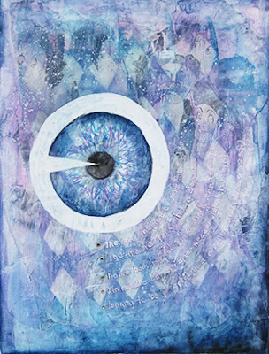
Collage with torn magazine pictures, gesso, paint and then remove paint with sponge through a stencil. You have probably done this or at least seen it in a video. It needed a focal point so I chose an eye to echo the cartoon eyes in the collage.

The takeaway: When the first layer is overall grey, the final result will be overall grey and it is tricky to take it anywhere or develop a composition.

The surprises: I got surprisingly sharp edges from sponging through the stencil. And after watching so many vids on layering it was fun to actually do it myself. It worked!

Stamping with Watercolor


Gears 6/9/16

Art Journal Stamping with Homemade Foam Sheet Shapes

Stamping with Watercolor

The gears were stamped by dipping foam sheet shapes I cut into watery watercolor. I had to tinker to get the optimum amount of pigment. I found the color did not get laid down evenly but it was easy to move it around with a brush. Easier than penciling and painting each gear by hand.


The Composition

My original stack of gears (the darker ones) felt too unstable so I added a row of lighter ones on the left towards the bottom. Even with a stylized or abstract image, the brain still is pleased by balance and stability.

The background is stamped with pleated rubber non-stick padding. I drew the arcs to the left of the gears to symbolize how one's actions send ripples out into the world.

The surprise: is that there were no surprises. I planned it and executed it and it looks good but...maybe it is time to dig deeper and take more risks.

Tracing Paper, Who Knew?


Collage with tracing paper and gesso.
Ball Perfection 6/7/16

Art Journal Tracing Paper as Collage Fodder

A Surprising Texture

Wanted to do a rubbing of the mason jar I had in the kitchen, but what paper to use? The best thing I had on hand was tracing paper and my cheapo Prang watercolor pencils. When I went to activate the watercolor, I liked the way it rippled the paper. (I emphasized the ripple with gesso, see the close-up detail in the lower image.)

I painted some blue and green circles on tracing paper with watercolor to experiment with this further and ended up using that and the mason jar rubbing as collage fodder.


The Composition

After I glued everything down, I completed the circles where I had torn the tracing paper. I penciled in the tree-trunk shapes and partial frame (on the bottom left) and painted with watercolor. I gessoed the circles to lighten them. I realized that my cheapo Prang watercolor pencil colors do not harmonize with my favorite tube watercolor hues. Drawing the red circles around the blue and green shapes eased the color clash. It was time to invest in a set of Inktense pencils by Derwent.

The each tree trunk points to the other tree and the small circles on the top left curve around toward the tree. This is called drawing the eye around. It makes the overall composition more pleasing and gives the viewer unconscious clues on where to look. 

The surprises: a throw-away test can generate a pleasing page. And watercolor pencil strokes left unactivated next to some that are activated is a cool look.

Monday, July 18, 2016

Dottical


Watercolor frog painting.
Dottical Frog 6/2/16

Art Journal Page with Watercolor

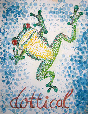
This was a prompt art journaling group chose: do something with dots http://daisyyellowart.com/vividlife/prompt60-10.html

The background is bubblewrap as a stamp with watercolor. Penciled a drawing first, then all dots with paintbrushes and final touch of liquidy highlights on the eyes and fingertips. Great fun. 

The surprise: learned a new word: "dottical".

Chain Links


Making marks with household objects
Heart

Art Journal Page with Watercolor and Household Objects

Chunky Bracelet

Still obsessing about what household items I could use to texture,  I picked up a chunky bracelet and dipped it in thin watercolor. Hitting the page just made little circles, but dragging the bracelet made these parallel swooping marks. Oh this is interesting. Going back in with a paint brush to add more swoops did not work, the lines were clumsy and for weeks I did not trust my hand to make good marks on the page, but I am getting over that now.


The Composition

When I had a good balanced mass, the overlapping swoops were way too chaotic so I stated to fill in the spots with a paintbrush. Even the same hue had a different tint so you could distinguish the original marks from the fill-ins. It reminds me of tissue slides for a microscope or a textbook diagram of a heart with color coded arteries and veins. As I continued to fill in, I balanced red and blue and balanced the overall image. Completed with added darker blue to some of the shapes to give it a focal point.

The surprise: Generating an energetic painting with a bracelet.

Knowing When to Stop


Collage with telephone book, parrot.
Parrot

Art Journal Page with Watercolor and Household Objects 

Game Piece as Stamp

What items do I have in the house that will make good texturing stamps? Gets the hamster wheel brain spinning.

The background is watercolor stamped with a plastic game piece and rubber non-slip padding. 


The Composition

All over is boring, a group gathering upward into a line has movement and energy.

Bird was cut from a telephone book (they are still useful for SOMEthing) and Mod Podged.

The surprise: less is more.

Creative Building Blocks: Squares, Circles and Letters and the Action to Put Them Together

Metallic paint rust effect. Stenciling.
Cover

Art Journal Cover

Working in a 9x12 multimedia paper journal by Canson.


The Composition

The diagonal creates energy and a way to organize the shapes.


Watercolor Rusty Effect

For the gear,  I painted on a separate sheet with metallic watercolor straight and mixed with a darker red-brown watercolor (brown madder) to get the rusted look, and cut it out. This cover was my first try with gesso through a stencil. The background texture is stamped with a rubber non-slip pad. 

The surprise: the way the center of the gear creates a mini-frame to highlight a chunk of the background. 

Monday, July 11, 2016

I Got Seduced Slowly

 The leader of my zentangle group (which is now also my art journaling group) took us through Brene Brown’s art journaling course on her book The Gifts of Imperfection. I had not made much art for a few years and I had forgotten how compelling it is to to tinker with the page, to PLAY. Brene Brown, bless her heart, had really basic art journaling instruction. She was speaking to people who are terrified of making art due to perfectionism and there is a need for that, but I had studied drawing, painting and graphic design so I was starting at a different level. I was ambivalent about continuing art journaling and set it aside for a time to do an animation project. But I wanted to keep participating in the group because I so enjoy the people in it. (They GET it). Now I am so grateful to them for turning me on to art journaling. It has pulled me out of a depression and given my creative life a new direction. I love having a group to show what I have done and see what they have done. We do assigned prompts from http://daisyyellowart.com/vividlife/prompt60-index.html If you’re not in a group, I invite you to start one.

A couple months later I started watching the art journaling videos on youtube and I was totally wowed. I remember watching someone put down some tissue paper ephemera and then putting a resist through a harlequinn stencil and then putting paint on and wiping it away so the ephemara was visible through the resist. Well how cool is that? I gotta get me a harlequin stencil. And now I am designing my own stencils.